How has changing technology and social context affected typographic design and perceptions of legibility?
“Type is everywhere today, from the printed pages to our mobile devices in our hands and from our everyday personal exchanges to the global cityscape. Yet many people are oblivious to its presence... The capacity to hide in plain site is the secret that gives type its performative power, enabling it to influence communications subliminally to create mood, provide a tone of voice, evoke emotional responses and disclose information progressively through emphasis and diminution.” (McNeil, 2017a, p7)
Typography is a dynamic field that is constantly evolving to meet the demands of society. It adapts to technological advancements, cultural shifts, and design trends. Within the digital age, typography has expanded beyond print to encompass web and mobile platforms, demanding it to be responsive and versatile. As design preferences and communication styles change, typographers experiment with new styles, layouts, and typefaces, ensuring that typography remains relevant and effective in conveying messages across a variety of mediums and contexts.
My essay will explore how changing technology and social context have affected typographic design and perceptions of legibility. Legibility is an element of design that is constantly changing, what was once considered legible is completely different today. These developments in both the perception of legibility and its importance in relation to aesthetics are a result of continual interaction between changing technologies within the design field and the social context in which design is presented.
Typography is an integral part of storytelling, branding, and the visual language of contemporary communication. While typography is becoming more expressive, legibility remains essential. Designers balance artistic expression with the need for clear, readable text to ensure effective communication. My practical work will explore the relationship between type and legibility and how often, after my dyslexia diagnosis, I recognise how frequently designers overlook legibility as a key consideration for accessible design. In the pursuit of aesthetics and creativity, it is easy to prioritise visual appeal over functionality.My work aims to simulate the problems faced by people with dyslexia and to convey how frustrating it is to try and read something simple.
My dissertation aims to cover the key stages of the development of typography and analyse how the available technologies and social contexts of the time influenced these developments. I aim to show how the ‘balance of power’ has shifted, from the first printed materials to the present day, between legibility and aesthetics and demonstrate the key factors that caused these shifts.
Chapter 1: A typographic evolution
Erik Spiekermann states that “typefaces were perfectly legible only a few decades ago but can hardly be read by anybody today. It has to do with cultural perceptions, not the physical properties of the typefaces” (Spiekermann, 2022). Gerard Mermoz states that “the legibility of letter forms and graphic layouts is relative and culture-bound” (Mermoz et al., 2014, p105). The notion of accessibility and legibility has developed over time to now become something that should be considered in all forms of communication and be dictated by the user. My first chapter explores the development, use, and application of formal typography in the Western world. It highlights how these aspects had little relevance or attention at the time, with other factors being deemed more important. As I said in the introduction the ‘balance of power’ within the development of typography has shifted between aesthetics and legibility.
Before Johannes Gutenberg’s printing technology evolved, handwritten scripts were the primary medium for recording and disseminating information. The legibility of these scripts was largely influenced by the writer’s skill and the intended audience. For instance, the Carolingian minuscule in the ninth century was developedout of the need for some form of consistency and cohesiveness in the display of text. It was renowned for its clarity and readability and served as a foundation for the Roman typefaces that followed. The lower-case letter forms were wide and open, with distinctive ascenders and descenders. Over time letters became less wide and more angular to accommodate a faster writing style and to save on resources. The function and the need for an increasingly literate population led to these functional changes and led once more to a very distinctive, less readable and ornamental type known as blackletter.
Western typography started to evolve technologically during the middle of the fifteenth century due to the development of movable type. This idea of type mobility was a system of casting identical letters with metal to create different combinations, invented by Gutenberg although the Chinese had developed printing centuries before. Gutenberg’s type copied the forms of letters written by professional scribes in fifteenth century Germany. Increasingly scribes and calligraphers hand wrote manuscripts with each rendition differing from the last, spellings differed, whole words differed, resulting in a need for standardisation and accessibility in the dissemination of information and the democratisation of the written word. Graphic designer Paul McNeil says the revolution of the printing press “released medieval culture from the limitations of orality and writing by precipitating the spread of knowledge and ideas” (McNeil, 2017b, p11). Gutenberg developed ‘Bastarda’ typeface in 1454 which feels more comprehensible and legible to the contemporary user and seems to incorporate more of the values of Carolingian minuscule. In 1455 he developed ‘Textura’ blackletter typeface which feels a lot more formal than Bastarda in appearance. Was legibility even a consideration in the design of this typeface?
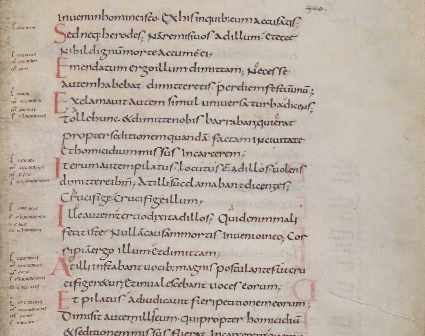
Figure 1 - Page of text from a Carolingian Gospel Book, written in Carolingian minuscule. (820–830 AD)
McNeil says that “Textura might look spiky and rigid and therefore be perceived as illegible. However, Gutenberg’s editions should not be judged out of context.” (McNeil, 2017c, p15) Textura was designed and used to print the 42 line Bible, the earliest mass-produced book printed in Europe using metal movable type. Its appearance is heavy, structurally solid, narrow in width, lacking curves and doesn’t make reading accessible or particularly friendly. It feels highly illegible to the contemporary viewer when read out of context, but it was designed to imitate the handwritten manuscripts that only the privileged few could access or indeed read.
Handwriting is read easily by the person writing but not universally legible. This notion of emulating personalised handwriting as an expressive form of communication has ceased to be important or necessary now, albeit in the personal expressive forms of graffiti writing. Typographic presentation within the 42 line Bible was just as essential as the content. Due to the limited number of readers and widespread lack of literacy skills, legibility in this period appears to have taken second place to the aesthetic considerations. However, Gutenberg’s technological leap initiated the spreading of knowledge within western society which has grown exponentially in the current digital age. Verbal communication in the recitals of these manuscripts gradually receded as literacy levels increased, which in turn McNeil states led to “radical socio-political changes, a new scientific mode of inquiry that initiated the modern era,” (McNeil, 2017d, p11).
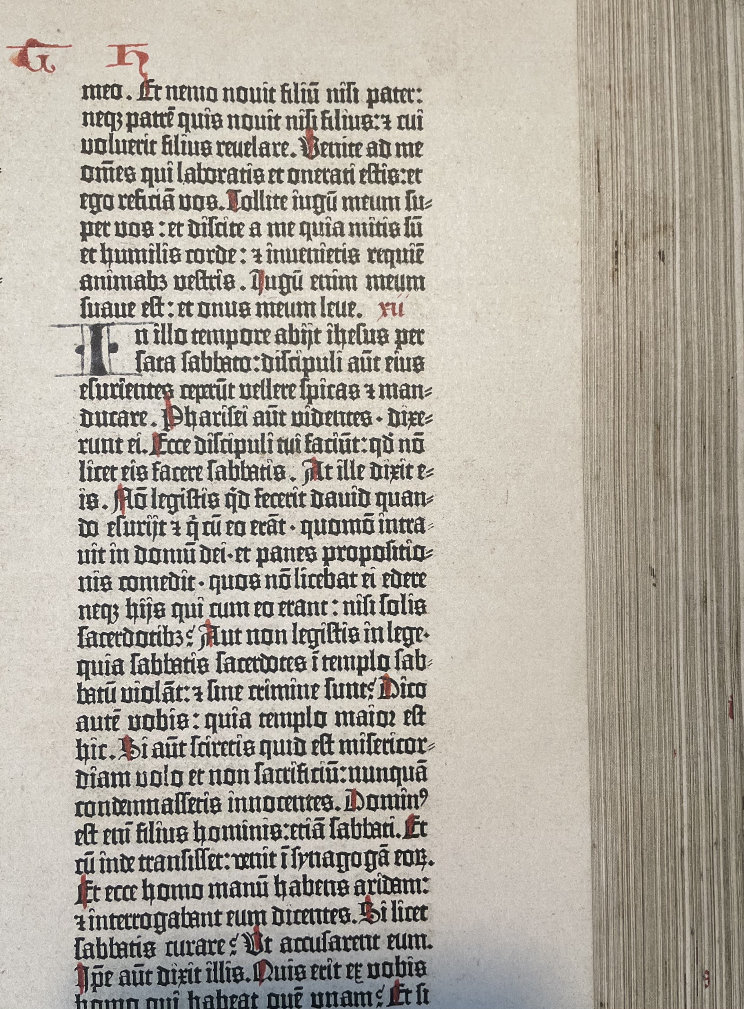
Figure 2 - A close up of Johannes Guttenberg 42 line Bible. Printed with letterpress and set in Textura typeface. (1455)
Figure 3 - Johannes Guttenberg 42 line Bible. Printed with letterpress and set in Textura typeface. (1455)
As someone who finds tackling large blocks of text daunting, the use of Textura and the composition of the layout within the 42 line bible looks beautiful in its formality, but more like a repeated textural pattern than something that conveys meaningful information, much like how I respond to assimilating text in a newspaper. It feels raw, physical and possesses a dark intensity. I can’t connect to the meaning of the text, but then it doesn’t connect to my own reality and therefore I am looking at it out of context. Sofie Beier, in her research, ‘Typeface Legibility: Towards defining familiarity’ includes the quote by The Emigre type designer Zuzana Licko that “Readers read best what they read most” (Licko, 2011a, p174) making the point that typefaces are only legible if they are familiar to the reader. Licko also defined legibility as being a “dynamic process, as readers’ habits are ever changing” (Licko, 2011b, p174). This is certainly true in today’s climate when technology is constantly and rapidly moving in new directions and the demands on the reader are becoming ever more challenging. As someone who struggles with making sense of and engaging with text, I tackle these design challenges in two opposing ways within my work. It can look visually sparse, paring back to essential, or it can go in the opposite direction and become more conceptually responsive, personal and emotive.
Despite being fairly inaccessible in a contemporary context, Textura possesses a gravitas that transcends time in the way in which we perceive it now. Even though it was designed 500 years ago it has permeated the typographic landscape and become ubiquitous, and now the look and feel of blackletter carries different connotations compared to the landscape in which it was originally designed. Aside from the mere aesthetic feel of Gutenberg’s blackletter scripts, they also held cultural significance, being promoted as essentially German, they strived to elevate and reinforce the national identity. ‘Eye’ magazine article, ‘Meanings of type’ it states: “Not every typeface is transparent, not all typography recedes; certain types symbolise philosophies and ideologies, some represent institutions, nations, and cults, many have intrinsic meaning.” (Eye Magazine, 2003). Blackletter type became part of the German identity and seemed reluctant to give way to the more legible Roman typefaces being developed in Italy.
Nowadays Blackletter Gothic type is primarily used for its visually striking and ornamental qualities. Dan Reynolds says, “blackletter type can now be both ornate and almost abstract.” (CommArts, 2023) It has morphed into being used for headlines rather than body copy as originally intended. The New York Times masthead which uses a blackletter typeface works less as a legible piece of text but more as a recognisable symbol or emblem synonymous with the newspaper. Blackletter typefaces today still possess their medieval feel, they still feel authoritative, expressive and intimidating all at the same time.
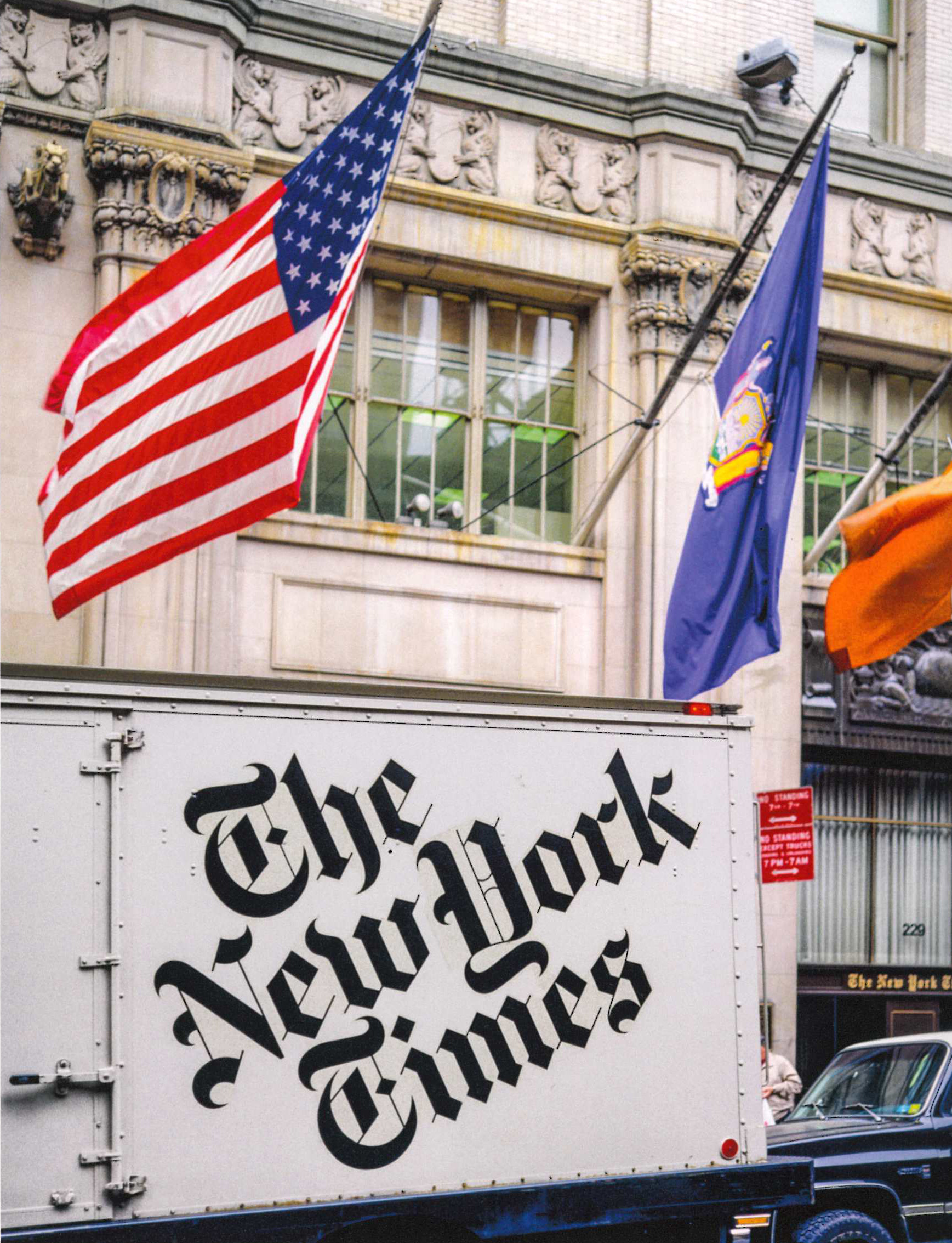
Figure 4 - See right. The New York times masthead on delivery truck (1980s)
Chapter 2 : A typographic enlightenment
The Gothic typefaces dominated the German speaking part of Europe up until the Second World War when the need for international collaborations escalated the introduction and use of the Latin alphabet. The skeleton or pure forms of the Latin alphabet has stayed consistent for the last 500 years, yet an abundance of new and varying typefaces has been at the forefront of change escalated by technological changes in printing and responding to the social contexts in which they function. In contrast to the typography of Gutenberg when ornamentation and presentation were more important than legibility the central typographic movement of the 1950’s couldn’t have been more different. Now referred to as ‘The Swiss school of design,’ its roots were deeply embedded in what preceded it in the twentieth century. As Tony Pritchard states “the typographic baton is being handed from generation to generation.” (Pritchard, 2010)
The function of typographic design took a huge leap forward with Futurism. The ‘Manifesto of Futurism,’ written by Filippo Marinetti and published on the front page of the French newspaper Le Figaro on February 20, 1909, sought to embrace the technologies of the future. Herbert Spencer stated that “in futurism, social protest, new ideas and new ways of expressing them came together explosively, that futurist typographers scream with large black type, waving in all directions, and that, consequently the world of typography was blown onto a new course.” (Spencer, 2014, p112) Futurist typography was perceived as ‘noisy.’ Muller-Brockman referred to Italian Futurism as ‘bellicose.’ (Müller-Brockmann 1995a, p11) Typography became more expressive and less rational in its presentation of content. The composition of letters on the page now had to visually reproduce the verbal expressions they contained.
Designer Gérard Mermoz in his essay ‘Graphic Design History in the Writings’ 2012(year?) wanted to go further in his analysis of Futurism’s use of typography and make the connection between designer as author and to examine the ‘effects of typography on the presentation and interpretation of texts.’ Marinetti played with the conventional notions of language itself, using “unhampered words and with no connecting strings of syntax and with no punctuation.” Marinetti stated, “My revolution is directed against the so-called typographical harmony of the page” (History of information, 2023). This application of typography didn’t consider legibility and readability as its main focus but was meant to entice an emotional reaction in the viewer. This is in stark contrast to the Swiss school of design, which sought to eliminate any distractions in the assimilation of the text. Futurist expressive typography was the catalyst for the transactional dialogue between author/designer and the receiver within today’s context, one that demands the receiver to decipher and decode. The essence of traditional communication has been superseded by the designer as author, one example is the highly personalised typography of Edward Fella, who stated that he was building “an alternative practice of experimental typography.” (Unit Editions, 2023)
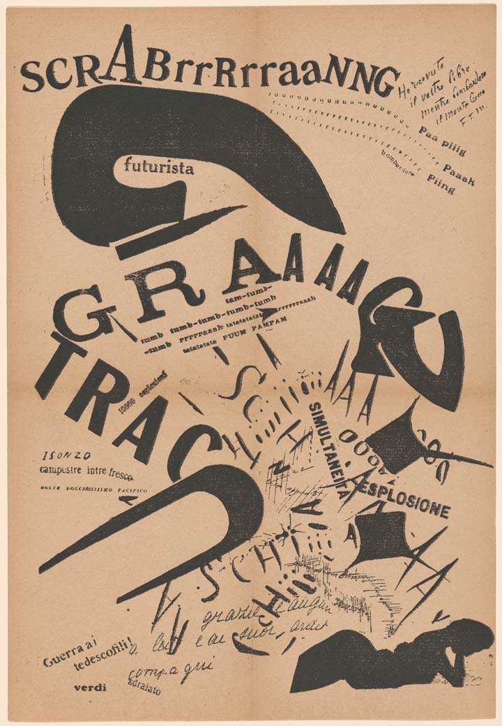
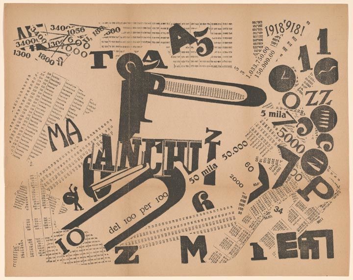
Figure 5+6 - Tavole Parolibere, free-word pictures, by Filippo Marinetti (1919)
The Bauhaus built upon the experimental expressive typography of Futurism, but function, accessibility and a typographic rational approach became more important. Jan Tschichold and designers from the Bauhaus school were united against the German style of blackletter and other typographical styles derived from handwritten forms. The move to the use of sans serif typefaces fitted with its industrial, social and cultural contexts as the increased volume of printed material required a revolutionary typeface that rejected the use of unnecessary ornamentation. Herbert Bayer developed what he called Universal lettering, a new sans serif alphabet that used only lower-case letters, according to him, to provide maximum legibility. His rationale for doing this was that since speech reveals no difference between upper and lower case, why should written text function differently? Personally, I find this approach highly problematic. With no sense of hierarchy or differentiation within the text, navigation of the text would be impossible. The recent idea of ‘bionic’ reading is contrary to this, which takes the user into consideration allowing them to customise text to their specific needs. It focuses not just on the aesthetic or the perceived ‘modern style’ of designing with just all lower-case text, but creating an individualised user experience.
Tschichold published Die Neue Typographie, (The New Typography) which was a textbook officially outlining his principles. The New Typography was a response to the disorder of typography in Europe. He was concerned with typefaces that were “easily legible; they are also above all in a technical sense useful and free from personal idiosyncrasies – in the best sense of the word: uninteresting.” He stated that “it must be laid down that sans serif is absolutely and always better,” (Tschichold, 1928, pg 76), this wasn’t because of readers preference at the time or do to with any researched notion of accessibility but determined by the designer’s personal beliefs in modernity.
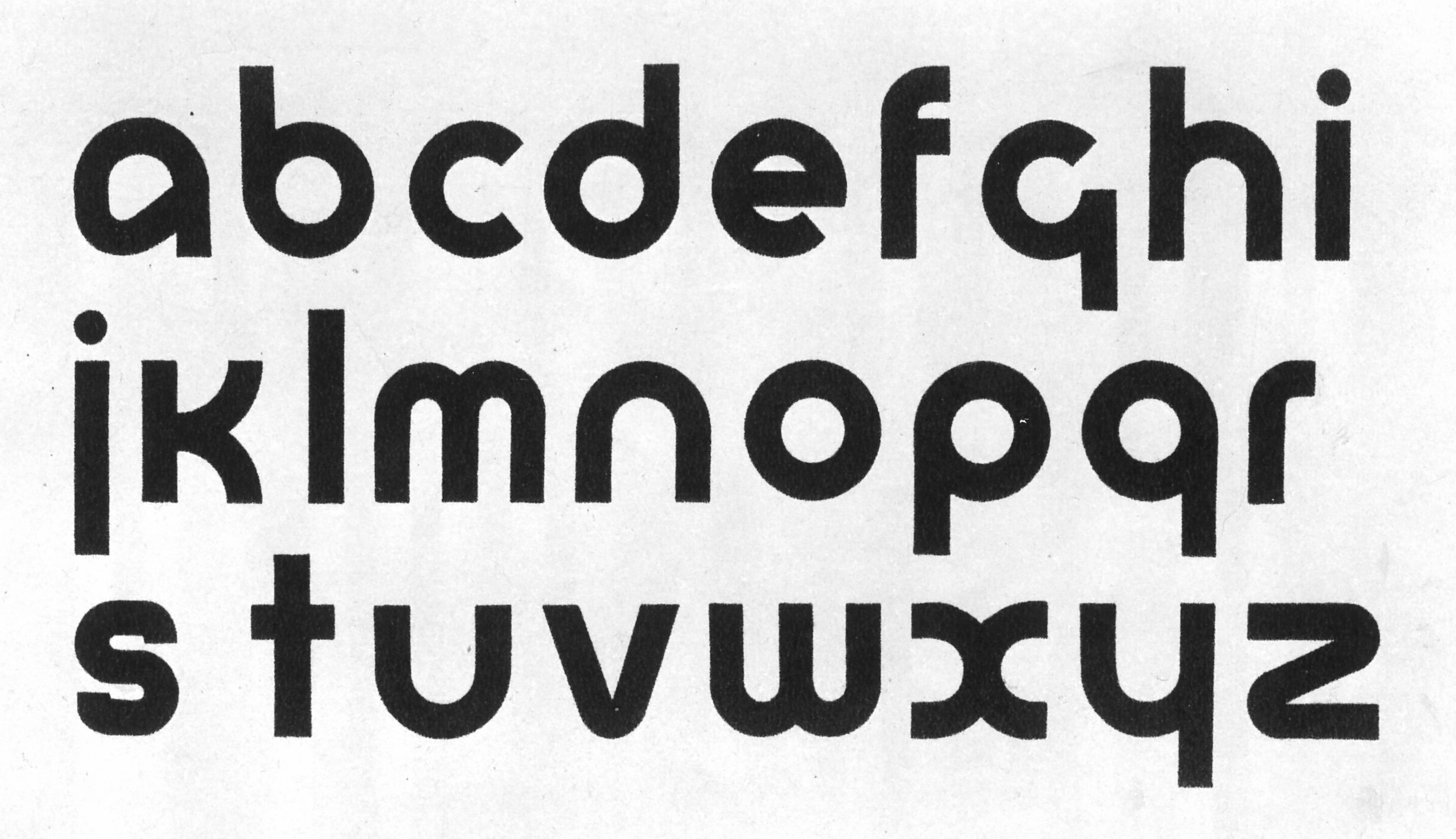
Figure 7 - Universal lettering by Herbert Bayer (1925)
Following World War Two, while the United Nations was being formed, a new and neutral visual language emerged in response to the propaganda of politics and by advances in print production. Designers began to move away from letterpress due to the introduction of photosetting devices. Then came the revolutionary offset litho printing process which enabled designers and typographers to take control from the printers and allowed more freedom within design processes. Neutral communication through universal clarity was a clear aim for designers within this emerging movement. Swiss designer Josef Müller-Brockmann stated “After four worthless years of war I wanted to have a positive, constructive role in society.” (Muller-Brockman, 1995b, p11) At the time this was referred to as ‘concrete typography’ later known as the Swiss school of design. The movement was deemed to have such importance that Karl Gerstner referred to it as ‘integral typography,’ (Typeroom, 2020).
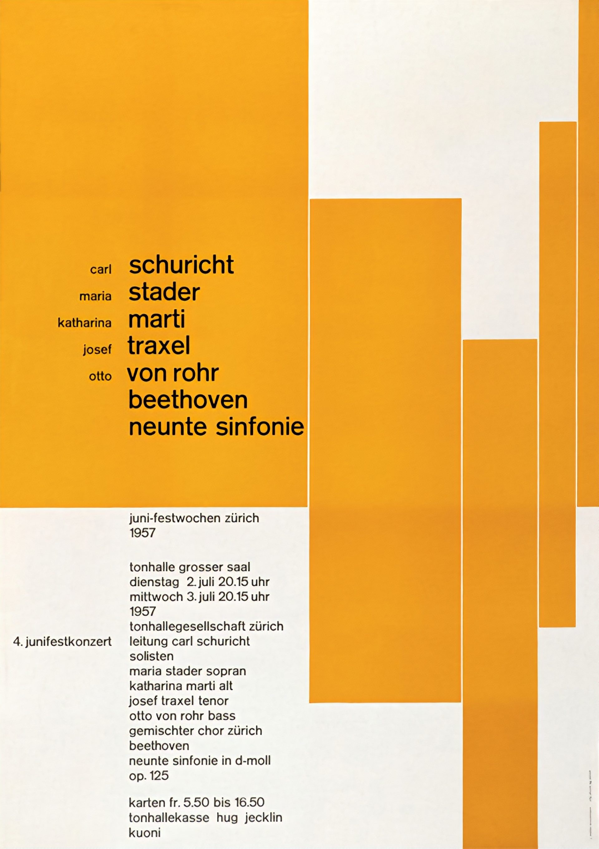
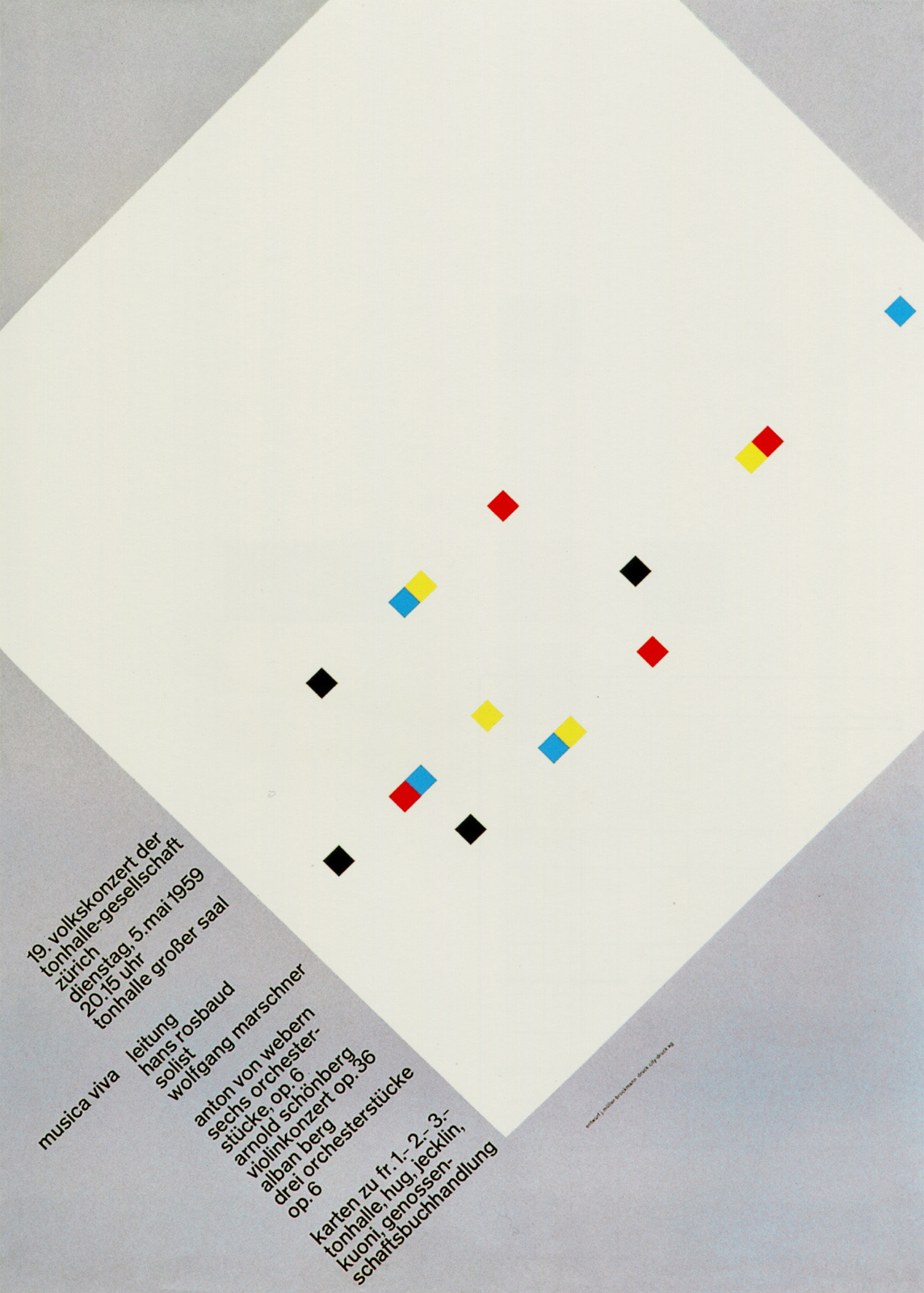
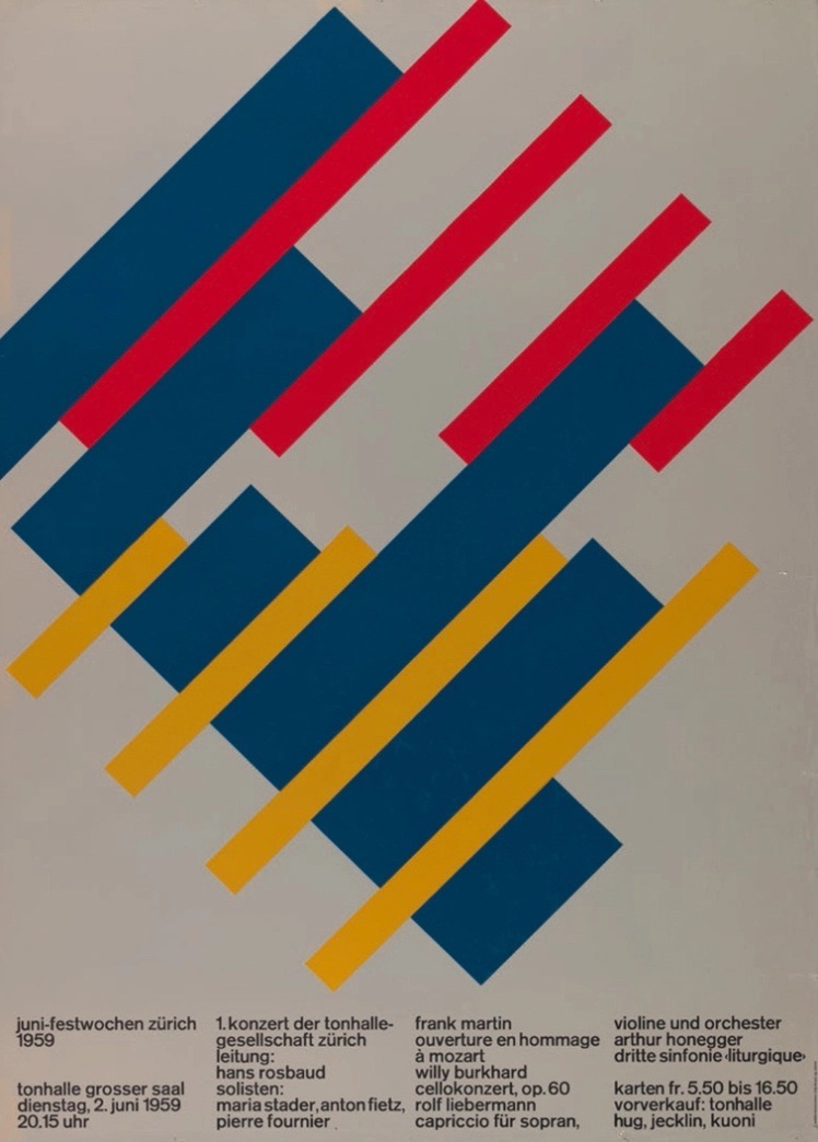
Figure 8, 9 + 10 - Work by Josef Müller-Brockmann (1957-59)
Muller-Brockman stated that “subjective interpretation leads to a falsification of the message.” (Muller-Brockman, 1995, p15) There was no room for interpretation by the viewer. Yet, I feel Muller-Brockman is bringing his own subjective views to bear in the adoption of this style. Legibility, accessibility and readability were inherent principles. Clutter was to be eliminated. A rigid set of rules were to be followed, the use of a mathematical grid used as an organisational system, which allowed for greater legibility and readability. Asymmetry instead of symmetry, the use of sans serif typefaces and photos to replace illustration. Information is broken down to be easily accessible. The ‘word’ is designed as units of information and becomes a strong and impactful visual element. The composition of the page helps the viewer to navigate its contents. The sense of pace and rhythm created within the application and placement of typography aids in the accessibility and assimilation of information. In keeping with the rigid set of guidelines, the consistent and repeated use of a limited palette of typefaces, for example, Muller Brockman’s preferred and repeated use of san serif typeface Akzidenz-Grotesk as well as the ubiquitous Helvetica and Univers makes the typography ever more familiar and easier to read. This has been backed up by Sofie Beier‘s research, ‘Typeface Legibility: Towards defining familiarity’ (Beier, 2009) that says the more we are exposed to different typefaces the more we become familiar with them. The same research stated that there is no difference in legibility between body copy text set in serif or sans serif typefaces.
Personally, I have always responded to the qualities inherent within the Swiss school. I remember within my university personal statement I had been analysing and trying to decipher my working process. I stated that a lot of my work possessed a ‘distillation of form.’ Working through a rational process of reduction, refinement and simplification. I now realise that I need to work within quite a rigid set of rules in order to make sense of the work I make and in order for it to clearly communicate. This is probably due to the difficulties I face when tackling large blocks of text. I also now realise that I break letter forms down into form, structure and repeated pattern, maybe as a way of deciphering it.
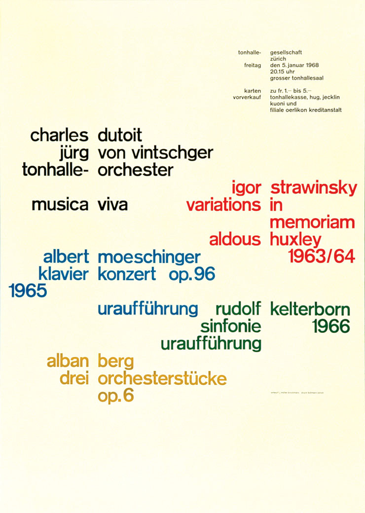
Figure 11 - Work by Josef Müller-Brockmann (1968)
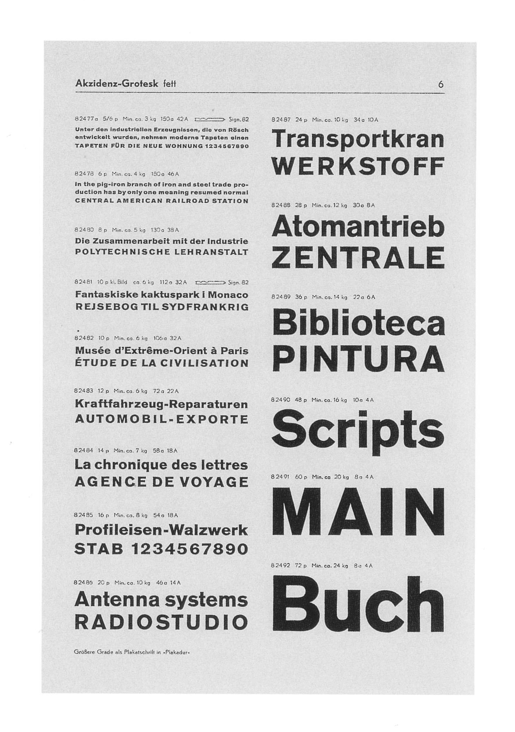
Figure 12 - Akzidenz-Grotesk Published by Berthold Type Foundry (1896)
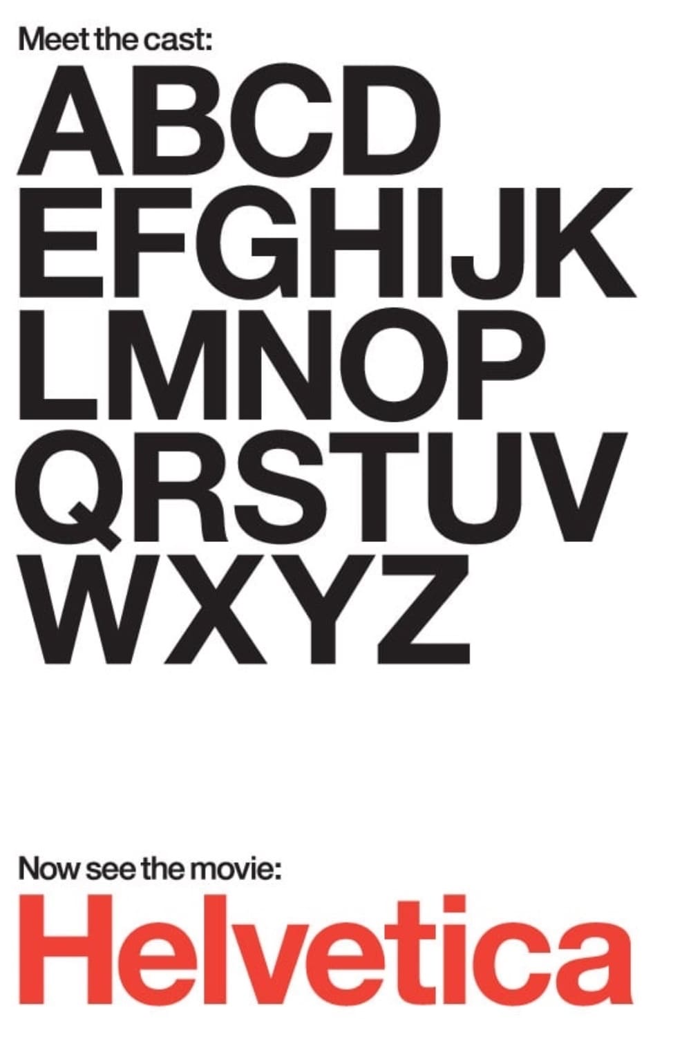
Figure 13 - Poster for the documentary ‘Helvetica’ (2007)
Chapter 3 Title: A typographic explosion
Wolfgang Weingart said, “I took Swiss typography as my starting point, but then I blew it apart.” (Eye Magazine, 1991) Weingart’s approach set the ball rolling for the new wave of digital typography. Social interruptions of the 1970’s and the realisation that Swiss typography’s reputation for maximum legibility and complete neutrality seemed outdated led to an explosion of new typographic forms. This idea of typography functioning as a standalone entity was epitomised in Wim Crouwel’s typeface ‘New Alphabet.’ Like Herbert Bayer before him he sought to pare back the forms to one system of letter forms that function as both upper and lowercase, which resulted in although aesthetically formally pleasing, a system of letter forms that were ambiguous and hard to understand. Zuzana Licko carried on this tradition, with Emigre magazine fighting against the ethos of Swiss typography. Zuzana Licko stated “Illegibility does not exist. Legibility is a fluctuating concept based on ever changing eye of beholders” (Licko, 2009). In some respect this is true, as increasingly the audience today is becoming more visually literate and open to challenge. Currently, the morphing and hybrid manipulations of typography, using multiple starting points and pushing to extreme immersive outcomes seems to be the norm.
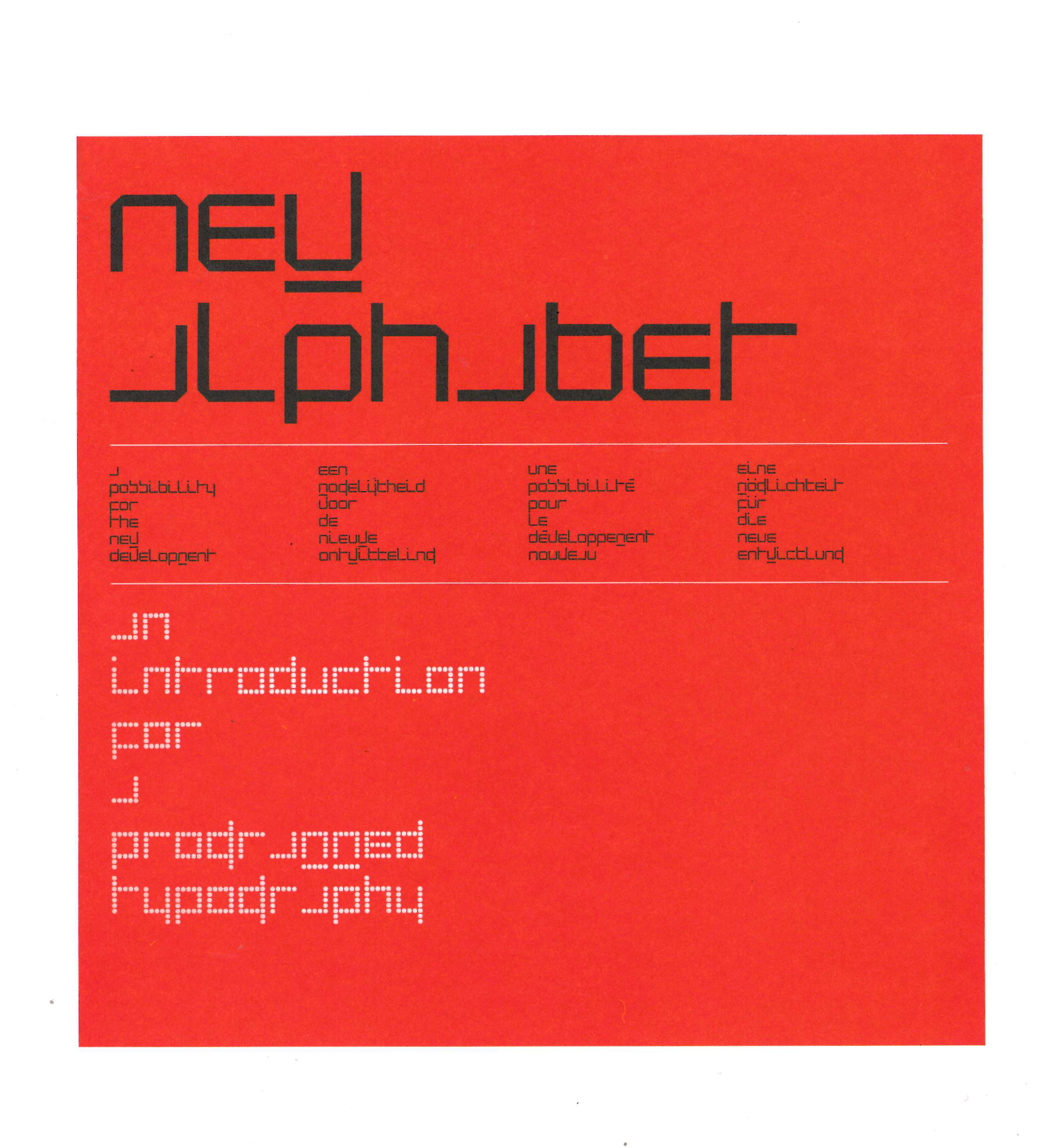
Figure 14 - ‘New Alphabet’ by Wim Crowel (1967)
According to ‘100 years of Swiss Graphic Design’, “in the early 90’s accepted codes of readability were re-charged and re-imagined by cultural codes, high and low, DIY and the vernacular.” (2014, pg282) Currently we are experiencing an unparalleled shift in the explosion of digital typography and our relationship to how type is being presented to us is being re-defined. Typography has a dominant role in our everyday lives. It is embracing not only a functional and accessible mode of communication “but today, with the help of a multitude of technological innovations and experiments, a new era is emerging where typography itself is able to embody mood and vibe like never before” (It’s Nice That, 2023).
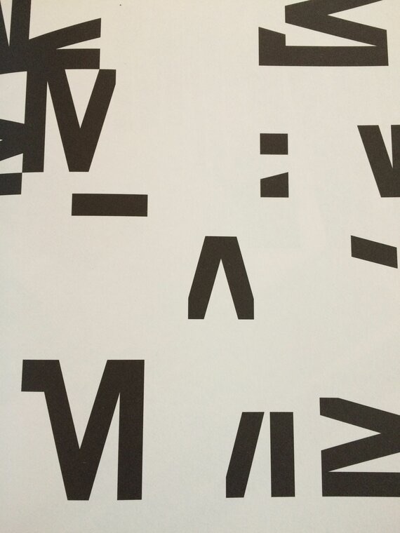
Figure 15 - Wolfgang Weingart, ‘Examination of the Letter M’ (1965)
Typography is being re-purposed into captivating visual narratives in the form of motion, it is being manipulated to the needs of the user and seems to be in a constant state of flux. Multidisciplinary designer Gianpaolo Tucci spoke of “embracing imperfections” and “moving away from typographic rigor” to create unique letter forms. (Eye Magazine, 2022) This seems in direct opposition to the premise of my essay, legibility. Mc Neil states that typography “has a capacity to hide in plain sight and is the secret that gives type its performative power, enabling it to influence communications subliminally.” (McNeil, 2017, p7) I both agree and disagree with this statement. A lot of contemporary typography ceases to work at that level. It is attention grabbing, intentionally illegible, aesthetically driven and strives to be immersive. What seems evident is that there has been a progression from ‘static to dynamic outputs’, discussed in this chapter. Where does the idea of accessibility and legibility operate in this sea of flux and how can new typographic technologies aid the conscious act of reading and comprehending information? This chapter discusses the awareness of legibility in a digital age and how it has/could become individualised, customisable and even universal. As well as the extent to which designers incorporate or even consider this within their design practice.
What happens when legibility is forced to be universal or how do we incorporate these strategies into static forms of communication? One example which set the standard for democratic and universal legibility was the standardisation of road signage. In the late 1950s, Britain’s first motorway was built. Before this there was no visual consistency within road signage, and so a government committee was formed to review the signage. The Anderson Committee decided that a system was needed to revolutionise the mismatched signage to create “a common language” and the job was given to Jock Kinneir and Margaret Calvert.
They had the difficult task of creating a universally legible typeface that was easily recognisable even when viewed at high speeds. “We started from scratch, with a letter form based on Akzidenz Grotesk. Important details, like the curves at the end of several terminals, were specifically designed to help maintain the shape of place names when slightly letter spaced – a necessary compromise to aid word recognition, when read at the appropriate decision-making distance.” (It’s Nice That, 2019a)
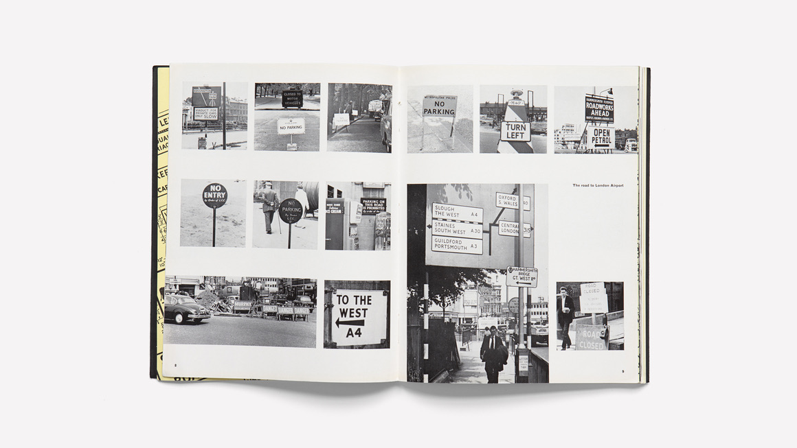
Figure 16 - ‘Mile-a-minute typography’ by Herbert Spencer showing how inconsistent the road signage was. (1961)
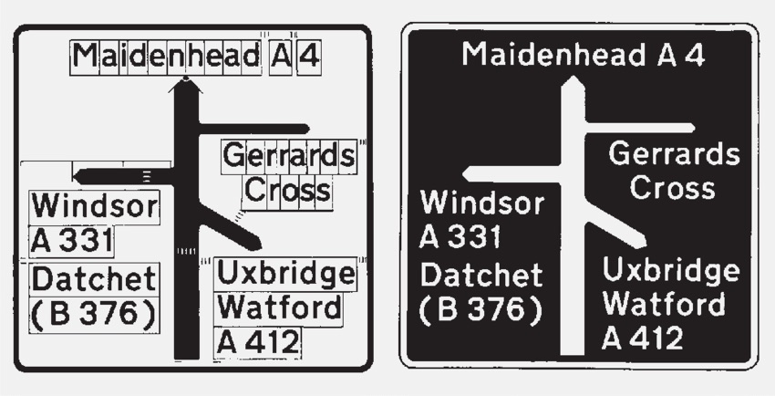
Figure 17 - Artwork showing the system dictating the layout of the signs, based on the width of the capital letter ‘I’, devised by Jock Kinneir.
Figure 18 - Typeface ‘Transport’, lower-case letterforms (1963)
After four years they created two typefaces, Motorway and Transport. The letter forms each had unique shapes to prevent confusion between similar looking letters when seen at a distance, certain letters had distinctive tails and the typeface was more rounded, all of which aided legibility. The thick stroke weights helped in making the text more recognisable, particularly in varying weather conditions. They collaborated with psychologists to gain insights into the cognitive aspects of reading and recognition while driving. This collaboration helped them understand human perception and the visual demands placed on drivers while on the road. They found that using both upper and lowercase letters in the signs increased legibility at speed. When explaining this, Calvert said “the whole point of using upper and lower case is to read place names, you read the shape at a distance, not every letter form; whereas with capitals, you just see a length.” (It’s Nice That, 2019b) This is dissimilar to Bayer’s idea that text should not function differently to speech and so only using lower case letters in his Universal lettering.
Figure 19 - Typeface ‘Motorway’ created in (1963)
The road and motorway signage system that Jock Kinneir and Margaret Calvert created is still considered to be one of the most ambitious and effective information design projects ever executed in Britain and core principles of their design have been used in other countries. The success of this signage leads us to believe that in certain situations legibility can be universal. Jock Kinneir and Calvert’s work showcases the power of thoughtful design principles and research in creating visuals that are legible and effective across diverse populations. While the success of the road signage suggests that legibility can have universal principles, achieving true universality is complex. Designers need to consider cultural and linguistic differences, individual differences and contextual variations. As discussed previously within my essay, the evolution of design trends also has a huge impact on perceptions of legibility and what was once considered legible, such as blackletter, could even be considered illegible today.
It has become evident through my research that designers up to this point in time have sought to portray a subjective personal visual language and assumptions were made about how the user interacted with that information. Despite the aesthetic qualities of the Swiss school, it was still about personal expression, albeit a very controlled one. With the aid of current typographic technological advances, the unique needs of the user are now able be taken into consideration by the designer.
The rapid increase in the availability of digital content means that, “we spend more time on our screens now than ever before, trying to consume a rapidly growing amount of information through digital devices. Reading quickly and comprehending this ever-growing body of information is integral to work, leisure, social interaction, and personal advancement.” (Wallace et al, 2022) Typography has a profound impact on how users perceive, navigate and interact with digital content. As the digital landscape evolves, we are able to access the same information on a variety of devices and normally do so at speed. Typography must adapt to responsive design considerations and prioritise accessibility and readability across a range of devices. In 2015 Google introduced their mobile friendly update, ‘Mobilegeddon’ which gave priority to websites that display well on mobile devices. This set about a shift in responsive design as companies adopted Google’s ethos of improving the user experience as much as possible to move higher up in the page rankings. Designers began to consider how to ensure that text remains legible and aesthetically pleasing regardless of the device being used. Responsive typography considers how type size, line spacing and line length can be accommodating to different screen sizes. Scaling type appropriately and having fluid layouts are a few of the strategies that designers should be aware of to ensure typography seamlessly adapts.
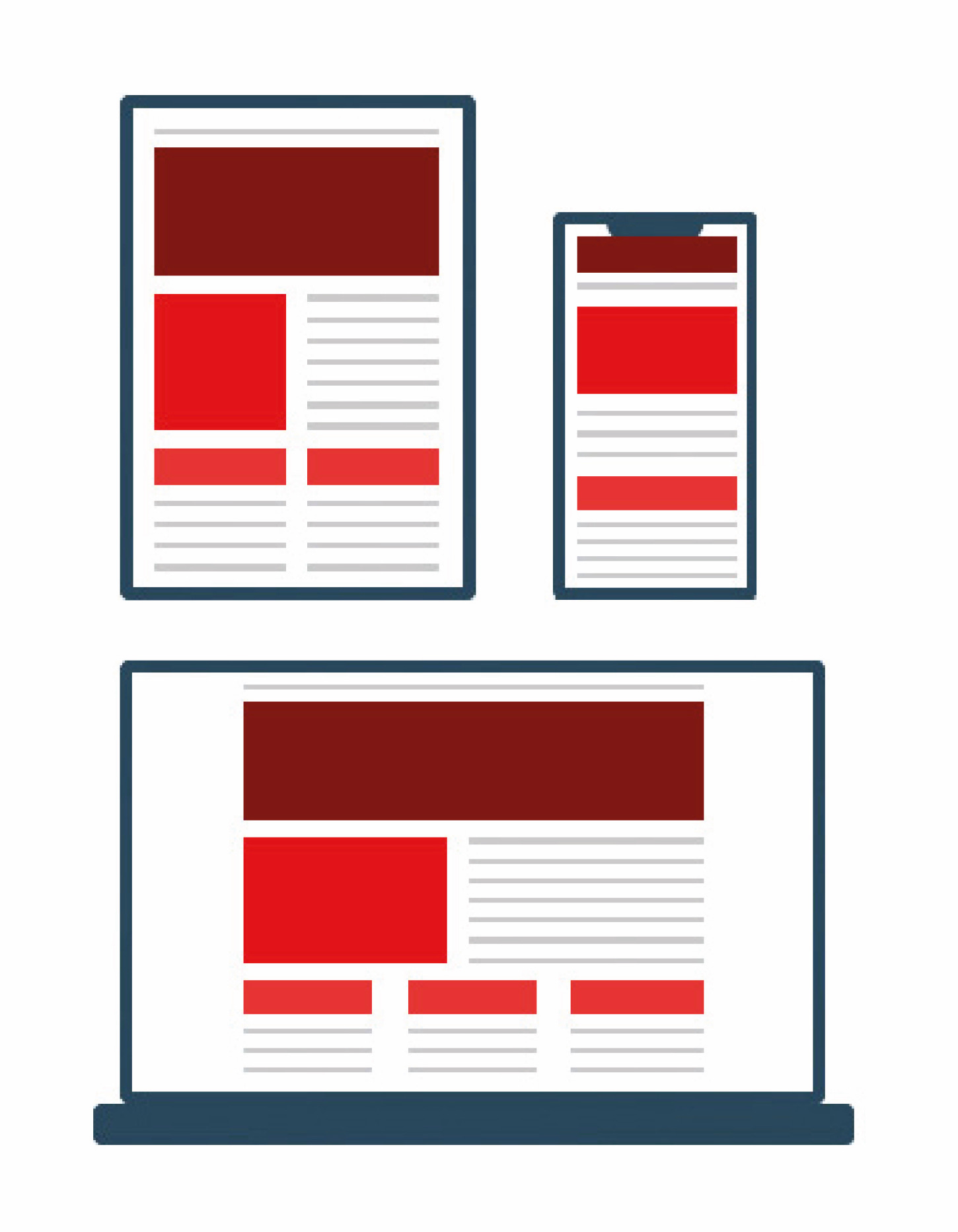
Figure 20 - Responsive design example showing how the interface adapts to the device’s screensize.
It is of vital importance for typography to be readily consumable by individuals with diverse needs. The Web Content Accessibility Guidelines (WCAG), first introduced in 1999, are a set of globally adopted standards for accessible typography regardless of the device used, including the use of readable fonts, sufficient colour contrast between text and backgrounds, and resizeable text without loss of content or functionality. The introduction of the WCAG played a pivotal role in improving the accessibility of the internet, making digital content more inclusive and accessible to a broader range of users, regardless of their abilities.
Variable type is a new format, introduced in 2016 that uses one font file to contain multiple variations. Google fonts and Monotype were among the first large companies to begin using variable fonts as they “provided designers with the power to fine-tune typographic compositions in ways that were previously impractical or impossible which is especially useful for web design.” (Sherman, 2023) Variable typography enables designers to adjust certain typographic characteristics like weight or width within a digital context, enhancing readability and user experience. Variable type “bundles the necessary DNA for every style into one tidy package,” explains Monotype. “This allows designers to move through the entire sequence – mixing, matching and custom creating millions of variations on the family theme – seamlessly through one file that is a fraction of the size of the combined static fonts.” (Monotype, 2021) The flexibility of variable type is especially beneficial in the context of responsive design as the content is able to react to different formats and contexts while remaining readable.
Even Helvetica, the ubiquitous typeface first made popular in the 50’s due to its expressionless nature has been revisited and re imagined by the type foundry Monotype. In response to the current ‘wave of interest’ in variable fonts, ‘Helvetica Now Variable’ came about. Friedrich Althausen, a type designer at Monotype explains a key design challenge was “translating the spirit of the original design to a cutting-edge, digital font format... From the tail of the small ‘a’ to rarely used reference marks, we discussed every detail, corrected, and tested extensively. The result is an amazing modern design tool and a new chapter in the illustrious Helvetica story.” (Monotype, 2021a). Helvetica Now Variable also includes compressed and condensed widths which gives designers infinite styles to choose from together with the existing weight and optical size variations. “Helvetica Now Variable invites designers to paint with type,” Monotype Creative Director Charles Nix says. “To unlock new modes of typographic expression - to reach beyond what previous generations of typographers thought was possible... Variable typefaces generally, and Helvetica Now Variable specifically, will reshape the concept of what the word ‘typeface’ means.” (Monotype, 2021b).
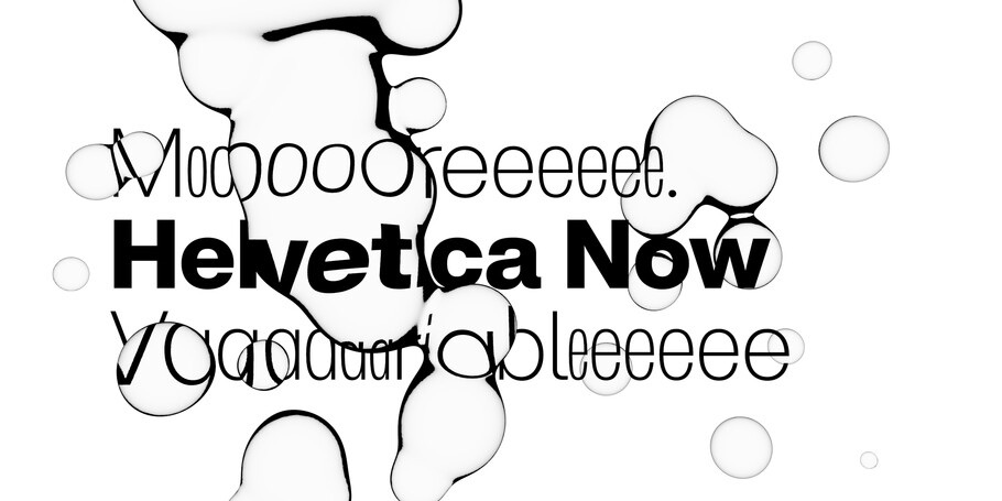
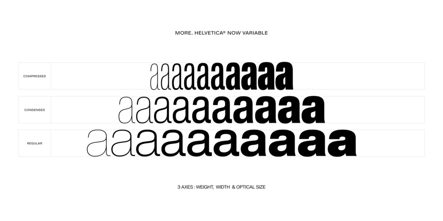
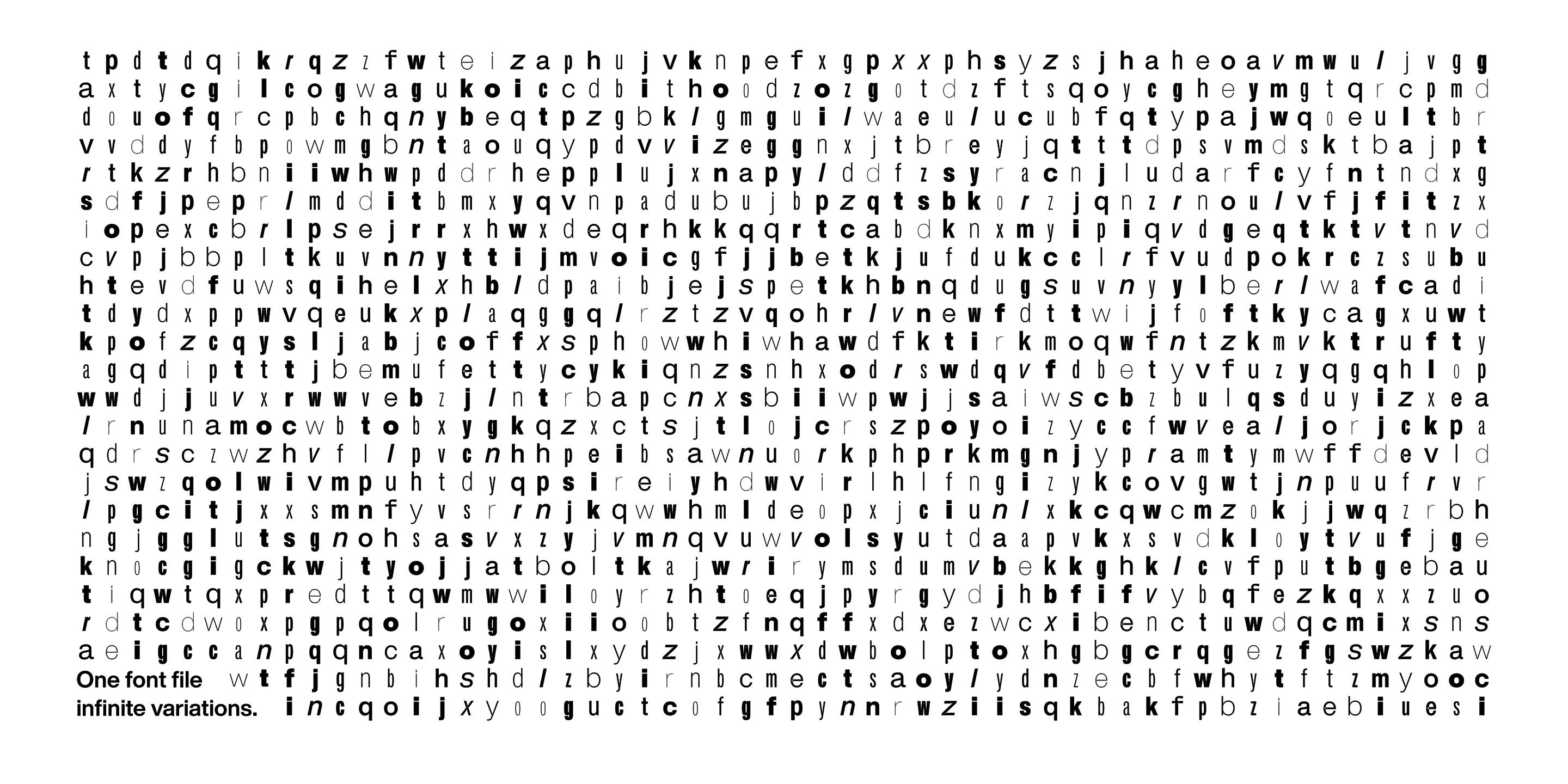
Figure 21, 22 + 23 ‘Helvetica Now Variable’, published by Monotype Studio. (2021)
Due to an increased understanding of user preferences and needs, legibility has evolved to become more individualised and customisable. In a study that looked at individualised reading experiences by Ben Sawyer and others it was found that changing the typeface to one better suited to an individual resulted in a 35% increase in reading speed while maintaining comprehension. Sawyer says, “These results emphasize that personalisation is key and encourage future work in creating tools and conducting research that help readers discover the format that optimizes their personal reading experiences.” (Sawyer et al, 2022) The study looked at a diverse group of 352 participants, from 18 to 71 years of age. It measured 16 common typefaces and their effects on reading speeds, preferences, and comprehension scores. This study highlighted the need for reading tools which allow personalisation of typefaces and fonts as well as further research into text formatting to help aid readers.
The early 1970s was a turning point for research surrounding reading difficulties and the formation of advisory services and associations. Previously known as ‘word-blindness’ the word ‘dyslexia’ came into common usage, and the idea of specific issues with reading that were not related to intelligence began to surface. However, it was only until 2010 that dyslexia became recognised as a disability under the Equality Act. As awareness grew surrounding reading difficulties it became more important to make information easily accessible. This brought about research into the psychology of reading and processing written information.
Reading begins with recognising and interpreting written symbols, and words. The eyes move across the text in a series of jumps called saccades and brief stops known as fixations. We then process this information in two ways, top-down processing where we recall previous knowledge to help us understand the meaning of the text, or bottom-up processing in which we interpret the text based on the actual words and letters, without relying on prior knowledge. This process of reading and processing written information is either helped or hindered by the presentation of the text and the typography used.
Bionic reading, created by a Swiss developer named Renato Casuut, aims to make reading easier by guiding the eyes through fixation points created by holding the initial parts of words. The idea behind creating fixation points came from a study by Adam Just, M and Carpenter, P (1980, pg 329-230). Carpenter who proposed that the duration of eye fixations “reflect the time taken to execute comprehension processes.” They found that “There is a common misconception that readers do not fixate every word, but only some small proportion of the text, perhaps one out of every two or three words. However, the data to be presented in this article shows that during ordinary reading, almost all content words are fixated.” Therefore, aiding this process would decrease processing leading to quicker reading speed and comprehension.
People with conditions such as ADHD or dyslexia have found that Bionic Reading enables them to immediately understand the content of various texts the first time they read them, which is usually impossible. I have found that bionic reading helps me a lot as the fixation points reduce blurred or moving words, enabling me to understand the text quicker rather than having to re-read the text several times. This was a clear aim for Casuut when creating Bionic reading (2023), “Bionic Reading® aims to play a supporting role in the absorption of volume text. We see technological progress as an opportunity for all those who want to increase the pleasure of reading in a noisy and hectic world in a focused way and without distraction.”
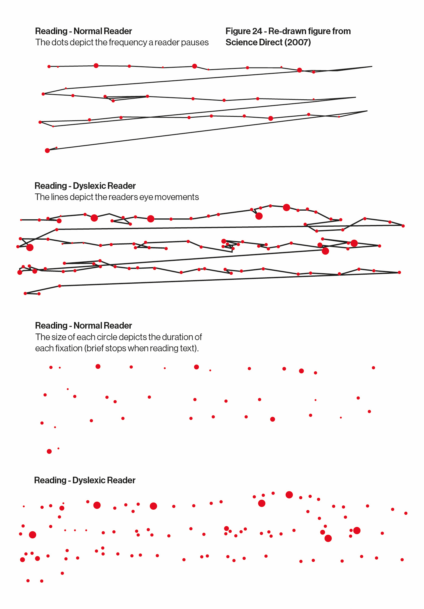
Figure 24 - Re-drawn figure from Science Direct (2007)
The bionic reading web application allows the user to import text and web links into a unified format. It enables the user to customise the text font size, spacing, colours and the fixation points within each word. The web app also strips the original source down to only the text, eliminating any distractions. As someone with dyslexia, if my eyes are drawn to something else on a page other than the text I am reading it becomes impossible for me to absorb the information into my short-term memory, hindering my comprehension. Therefore, the simplistic qualities of bionic reading means that distractions are limited which allows me to become more engrossed in the text.
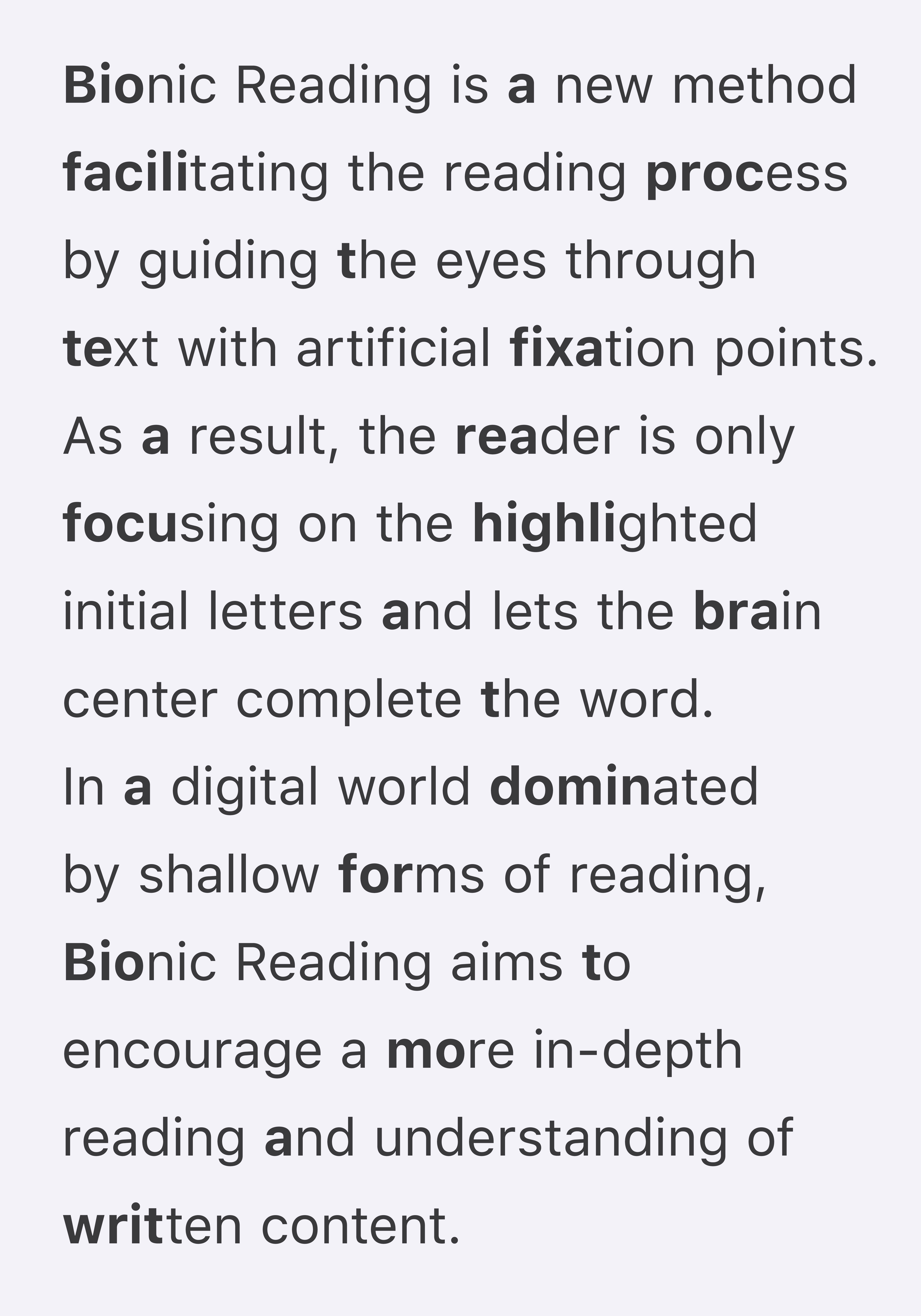
Figure 25 - ‘Bionic Reading’, created by Renato Casut (2016)
Choosing an accessible typeface is just the beginning when it comes to creating legible and readable content.
The manner in which words are presented can affect the way we read, and the way we think about the information presented. Effective typography goes beyond aesthetics; it structures content to guide readers through information hierarchies. Gestalt principles help designers organise elements successfully to establish hierarchies, ultimately improving the overall readability and comprehension of the design. By using the core principles: proximity, similarity, closure, continuity, and figure-ground, designers can create designs that are visually pleasing but successful, communicative, and engaging. Jan Tschichold helped pave the way for modern graphic design and typography in his book ‘The New Typography’ where he emphasised the importance of clear structure and visual hierarchy for effective communication and readability. He states, “The new typography is distinguished from the old by the fact that its first objective is to develop its visible form out of the functions of the text. It is essential to give pure and direct expression to the contents of whatever is printed... The function of printed text is communication, emphasis and the logical sequence of the contents.” (Tschichold, 1928) The idea of structuring text was also highlighted in the Swiss design movement after, following on from WW1, a neutral visual language emerged that structured text within a rigid mathematical grid.
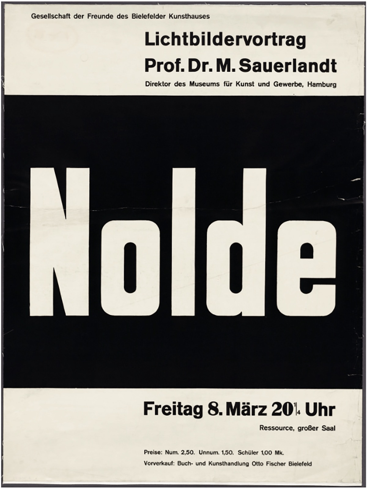
Figure 26 - ‘Nolde’ by Jan Tschichold, created using a grid system (1921)
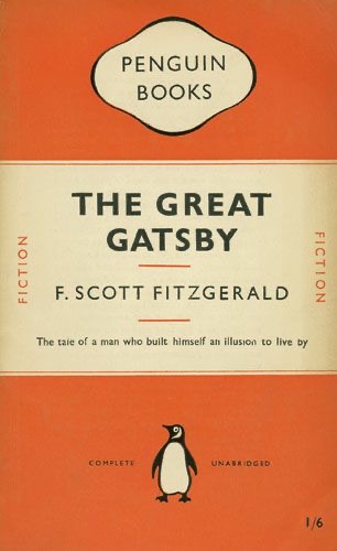
Figure 27 - Penguin Books cover by Jan Tschichold (1950)
A study by Linda Reynolds et al (2006), a researcher at the University of Reading, and others looked at ‘the effects of the text layout on the speed and accuracy of a reading task in an examination-type situation’. Three different text layouts were used which aimed to be more or less legible by differing line length, leading, alignment etc. The results showed that task time was significantly shorter, and the number of correct answers were significantly higher with the layout conforming to legibility guidelines. Similarly to the work by Jock Kinneir and Margaret Calvert, this research suggests that there are techniques designers can use to make text widely legible, however when appropriate the user should be able to customise their own reading preferences.
During the process of writing this essay I have gained valuable knowledge of how to design text to optimise legibility. My aim when creating a publication from the essay is to create multiple versions using different typefaces, each targeted at different groups such as people with dyslexia. When viewing the essay on screen my aim is to create my own website which allows the user to customise the text, similar to the bionic reading web app which allows the user to edit the text size, leading, kerning, background colour and alignment.
Conclusion
Typography has evolved throughout history from the early Blackletter type that was extremely ornamental to typefaces that have been pared back to its simplest forms such as Helvetica. When considering the technology and social context in which different typefaces were created, we are able to understand the aesthetics, functionality and origins behind them.
Legibility is an ever-changing construct but has always been necessary for inclusive communication. As our interactions move to digital platforms it becomes crucial for text to be readable on screens, websites and mobile devices. Clear and readable text helps transcend language barriers, facilitating communications across the world where people from diverse cultural backgrounds interact. Regardless of the pressing need for clear communications, it is clear that designers frequently overlook legibility as a key consideration for accessible design. My essay highlights key considerations when creating accessible design, the typeface and how the words are presented. Both elements of design can help or hinder the legibility of a text. This essay has helped me understand how to design for a specific audience and a broader one. Research and testing are also key to accessible design, the evidence for this is clear in the success of Jock Kinneir and Margaret Calvert’s road signage.
Designers are constantly battling between their own aesthetic preferences and what is considered accessible; successful design balances the two to effectively communicate. I believe that minimalist design is the most effective way to communicate, as it focuses on simplicity and clarity, making different forms of communication easily accessible to the viewer. However, this approach comes from my own difficulties when absorbing information that includes distractions and is therefore specific to my own aesthetic preferences.
Typography works hard in a saturated environment where we are bombarded with type in all shapes and sizes, with varying functions. It adopts a rigid system of rules yet within this type can effectively communicate and express the ethos of a national identity. Typography transcends time and political divides, playing a crucial role in our everyday social interactions. It takes center stage in mass communication and can both hinder and help in the dissemination of information and the assimilation of the written word. It works alongside technology and produces informative and transformative possibilities.
References
McNeil, P. (2017) ’The Visual History of Type’. Laurence King Publishers.
Spiekermann, E. (2022) ‘Stop Stealing Sheep,’ 4th edition. Find out how type works. Toc Pub Gmbh Publishers.
Mermoz, G., De Bondt, S., de Smet, C., Vignelli, M., Meggs, PB., Kinross, R., Aynsley, J., Scotford, M et al. (2014) ‘Graphic Design: History in the Writing.’ Occasional Papers Publishers.
McNeil, P. (2017) ’The Visual History of Type’. Laurence King Publishers.
McNeil, P. (2017) ’The Visual History of Type’. Laurence King Publishers.
McNeil, P. (2017) ’The Visual History of Type’. Laurence King Publishers.
Beier, S (2011) ‘Reading Letters, designing for legibility.’ Bis Publishers
Beier, S (2011) ‘Reading Letters, designing for legibility.’ Bis Publishers
Heller, S., Cassandre, A M. (2003) ‘The Meanings of type,’ Eye magazine. Available at: https://www.eyemagazine.com/feature/article/the-meanings-of-type. (Accessed: 2 November 2023)
Reynolds, D (2023) ‘Blackletter Today’. Available at: https://www.commarts.com/columns/blackletter-today. (Accessed: 2 November 2023)
Pritchard, T. (2010) ‘Typographic Hierarchy’. Available at: https://vimeo.com/13418563. (Accessed: 2 November 2023)
Mermoz, G., De Bondt, S., de Smet, C., Vignelli, M., Meggs, PB., Kinross, R., Aynsley, J., Scotford, M et al. (2014) ‘Graphic Design: History in the Writing.’ Occasional Papers Publishers.
Muller-Brockman, J (1995) ‘Reputations’, Eye Magazine No 19. Emap Construct Publishers.
History of information (2023) ‘Marinetti’s Manifesto of his Typographical Revolution’. Available at: https://historyofinformation.com/detail.php?id=4001#:~:text=My revolution is directed against,run%2through the page itself. (Accessed: 2 November 2023)
Unit Editions (2023) ‘Ed Fella: A Life in Images’. Available at: https://uniteditions.com/products/ed-fella-a-life-in-images (Accessed: 5 November 2023)
Tschichold. J, (1928) ‘The new typography : a handbook for modern designers.’ University Of California Press.
Muller-Brockman, J (1995) ‘Reputations’, Eye Magazine No 19. Emap Construct Publishers.
Typeroom (2020) ‘A book, a day: Designing Programmes’ by Karl Gerstner. Available at: https://www.typeroom.eu/a-book-a-day-karl-gerstner. (Accessed: 7 November 2023)
Muller-Brockman, J (1995) ‘Reputations’, Eye Magazine No 19. Emap Construct Publishers.
Beier, S. (2009) ‘Typeface Legibility: Towards defining familiarity’.
Available at: https://core.ac.uk/download/pdf/40037679.pdf
Schwemer-Scheddin, Y. Weingart, W. Ruder, E. Hofmann, A. (1991) ‘Reputations: Wolfgang Weingart’. Available at: https://www.eyemagazine.com/feature/article/reputations-wolfgang-weingart (Accessed: 28th November 2023)
Beier, S. (2009) ‘Typeface Legibility: Towards defining familiarity’.
Available at: https://core.ac.uk/download/pdf/40037679.pdf (Accessed: 15th November 2023)
Museum Für Gestaltung Zürich (2014) ‘100 years of Swiss graphic design.’ ‘Zürich: Lars Müller Publishers.
It’s Nice That (2023) ‘Five typography trends set to make waves in 2023’.
Available at: https://www.itsnicethat.com/features/forward-thinking-five-typography-trends-graphic-design-040123. (Accessed: 18th November 2023)
Eye Magazine (2022) ‘Access to the futures of type’. Available at: https://www.eyemagazine.com/blog/post/access-to-the-futures-of-type (Accessed: 18th November 2023)
McNeil, P. (2017) ’The Visual History of Type’. Laurence King Publishers.
It’s Nice That (2019) “It was such an important job that affected everybody”: Margaret Calvert in conversation with It’s Nice That’. Available at: https://www.itsnicethat.com/features/margaret-calvert-in-conversation-graphic-design-081019 (Accessed: 20th November 2023)
It’s Nice That (2019) “It was such an important job that affected everybody”: Margaret Calvert in conversation with It’s Nice That’. Available at: https://www.itsnicethat.com/features/margaret-calvert-in-conversation-graphic-design-081019 (Accessed: 28th November 2023)
Wallace, S. Bylinskii, Z. Dobres, J. Kerr, B. Berlow, S. Treitman, R. Kumawat, N. Arpin, K. Miller, D. Huang, J. Sawyer, B.
(2022) ‘Towards Individuated Reading Experiences: Different Fonts Increase Reading Speed for Different Individuals’.Available at: https://dl.acm.org/doi/10.1145/3502222 (Accessed: 30th November 2023)
Sherman, N (2023) ’Variable fonts are here. Now what?’. Available at: https://fonts.google.com/knowledge/using_variable_fonts_on_the_web/variable_fonts_are_here (Accessed: 2nd December 2023)
Monotype (2021) ‘Monotype Introduces Helvetica Now Variable Font, Including Over 1 Million New Styles’. Available at: https://www.monotype.com/company/press-release/monotype-introduces-helvetica-now-variable-font-including-over-1-million-new (Accessed: 2nd December 2023)
Monotype (2021) ‘More of everything, for everyone. Introducing Helvetica Now Variable’. Available at: https://www.monotype.com/resources/font-stories/helvetica-now-variable (Accessed: 2nd December 2023)
Wallace, S. Bylinskii, Z. Dobres, J. Kerr, B. Berlow, S. Treitman, R. Kumawat, N. Arpin, K. Miller, D. Huang, J. Sawyer, B. (2022) ‘Towards Individuated Reading Experiences: Different Fonts Increase Reading Speed for Different Individuals’. Available at: https://dl.acm.org/doi/10.1145/3502222 (Accessed: 30th November 2023)
Adam Just, M and Carpenter, P (1980) ‘A theory of reading: From eye fixations to comprehension’. Available at: https://kilthub.cmu.edu/articles/journal_contribution/A_theory_of_reading_From_eye_fixations_to_comprehension/6613262 (Accessed: 30th November 2023)
Bionic reading (2023) ‘Faster. Better. More focused. Reading.’
Available at: https://bionic-reading.com/br-about/#:~:text=Bionic Reading® aims to,Save precious time. (Accessed: 5th November 2023)
Tschichold. J, (1928) ‘The new typography : a handbook for modern designers.’ University Of California Press.
Reynolds, L. Santos Lonsdale, M. Dyson, M. (2006) ‘Reading in examination- type situations: The effects of text layout on performance’. Available at: https://eprints.whiterose.ac.uk/89222/1/Lonsdale M 2006_JRR_Text Layout.pdf (Accessed: 22nd November 2023)